Koosmik Brand Design
Comprehensive guidelines, brand identity and communication tools.
How I designed the visual language of Koosmik, a fintech startup providing payment services.
Logo Design
After a year or so using the initial logo I made at the very start of my work at Koosmik, I had the opportunity to rework the logo using feedback from users, consultants and my own experience. This result is for me a satisfying accomplishment as we reached something that had meaning for everyone and made sense from a design perspective.
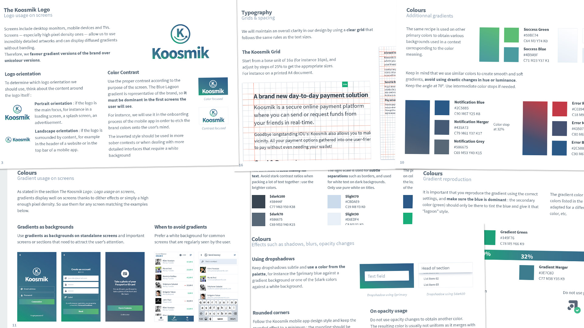
Brand Guidelines
As more people were working on the company’s projects, we needed a comprehensive guide for newcomers in order to maintain the brand identity and bring up to speed the freelancers. Since I worked on many medias (printed communication, web design, video), I consolidated all the good practices we discovered in this document.
On the developer side, they were also working on a detailed wiki for the mobile and web app, so both initiatives were part of a group effort to create an efficient design system for the company’s products.

Communication tools
As a regular designer, then lead designer, I ended up working on a lot of projects outside my realm of expertise (web) : printed content, physical goodies, social content, emailings. I am always keen on learning new fields, and gladly undertook the tasks of creating & leading these projects, always keeping in mind one idea : create documented and reusable content.
These projects include :
- Business card template on Illustrator, connected to a master InDesign project that generates print-ready PDFs when you feed it with a list of contacts
- Versatile Campaign Monitor template for newsletters and emailings about Koosmik
- Transactional emails for the Koosmik App. This in-depth article deals with the technical side of things and how it enabled translation and management to easily review the content.
- Corporate goodies such as notebooks, stationnery, convention booth flags, posters
